Meet
Brand Identity & Digital Experience
Bloofury
A modern brand built around bold character, creative energy, and a clear visual system that works across digital and print.
Role
Lead Brand Designer
Discipline
Identity · Digital
Year
2025
My work speaks for itself
Overview
Bloofury is a modern brand focused on delivering innovative and engaging experiences for its audience. The project aimed to establish a distinctive visual identity that communicates creativity, trust, and forward-thinking values and creating a consistent presence across every customer touchpoint.
The Challenge
The brand needed a cohesive identity that would differentiate it within a competitive market while creating a strong emotional connection with its target audience across both digital and print touchpoints, from the first scroll to the final brand touchpoint.
Deliverables
Character building
Logo design & visual identity system
Color palette & typography guidelines
Marketing & social media assets
Application & digital design direction
Brand guidelines documentation
Character Identity



My Role
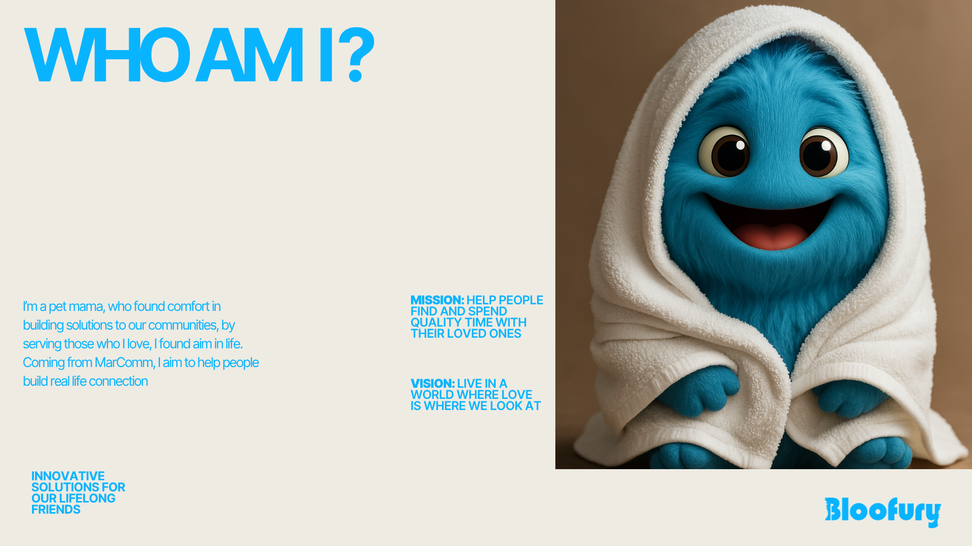
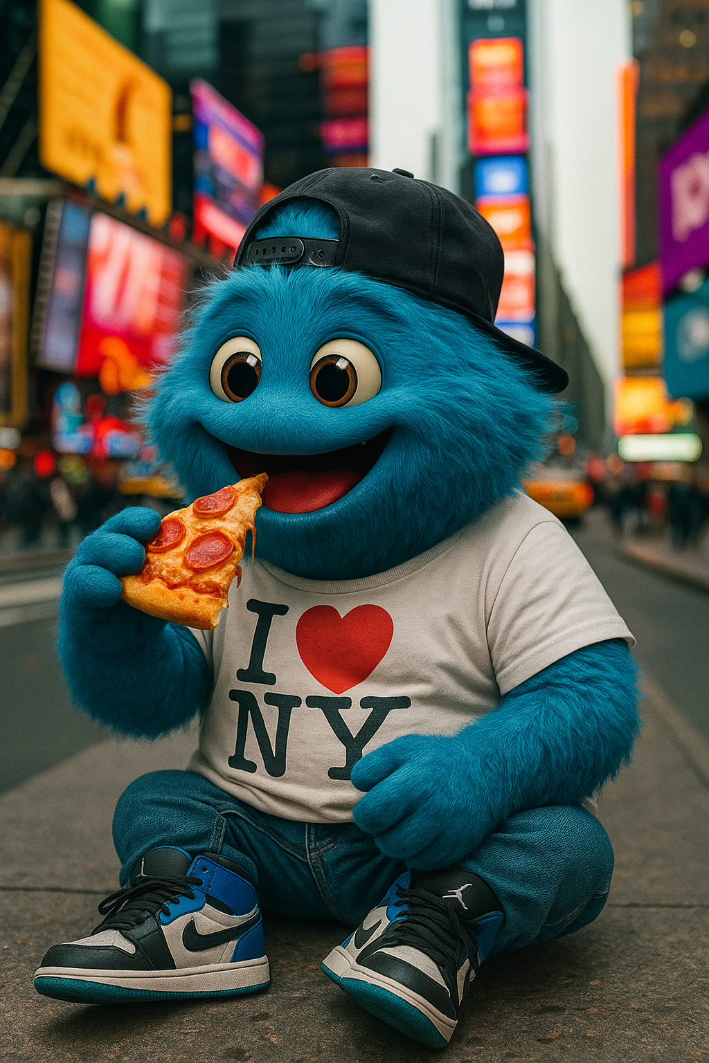
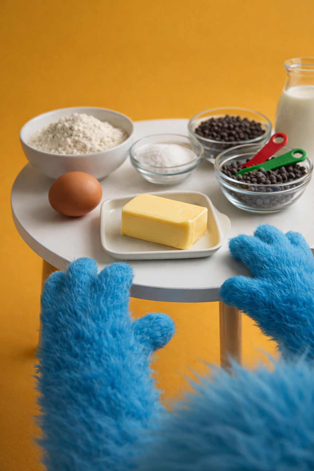
As Lead Designer for Bloofury, I created and developed the brand’s core character identity using AI-driven creative workflows. I defined the character’s visual appearance, personality, and proportions, establishing a consistent system that ensured Bloofury remained recognizable across all content and brand touchpoints. Beyond character design, I shaped the brand’s storytelling strategy by positioning Bloofury as the face and owner of the brand, building engaging social media narratives around his lifestyle, travels, and creations. My role combined character design, AI art direction, brand strategy, and content development to create a cohesive and memorable character-led brand experience.













Branding
Logo Development
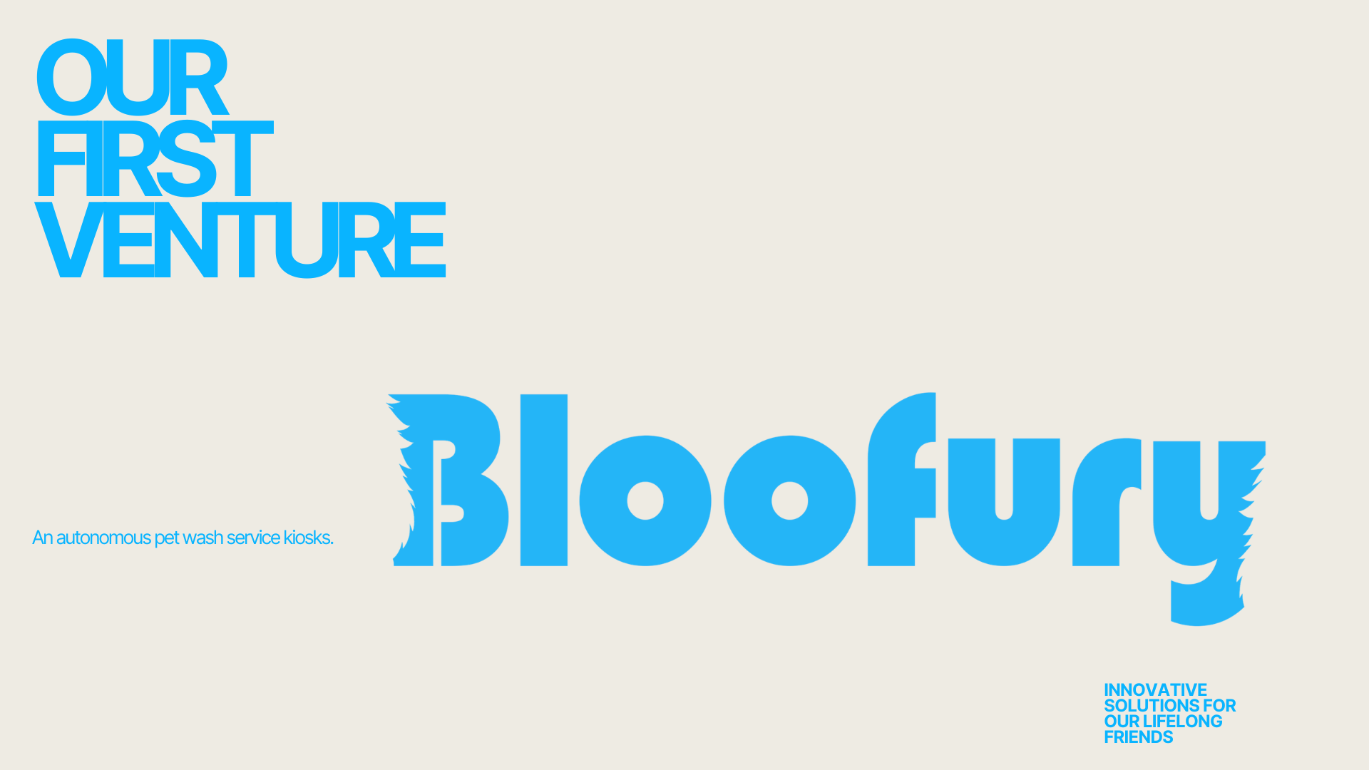
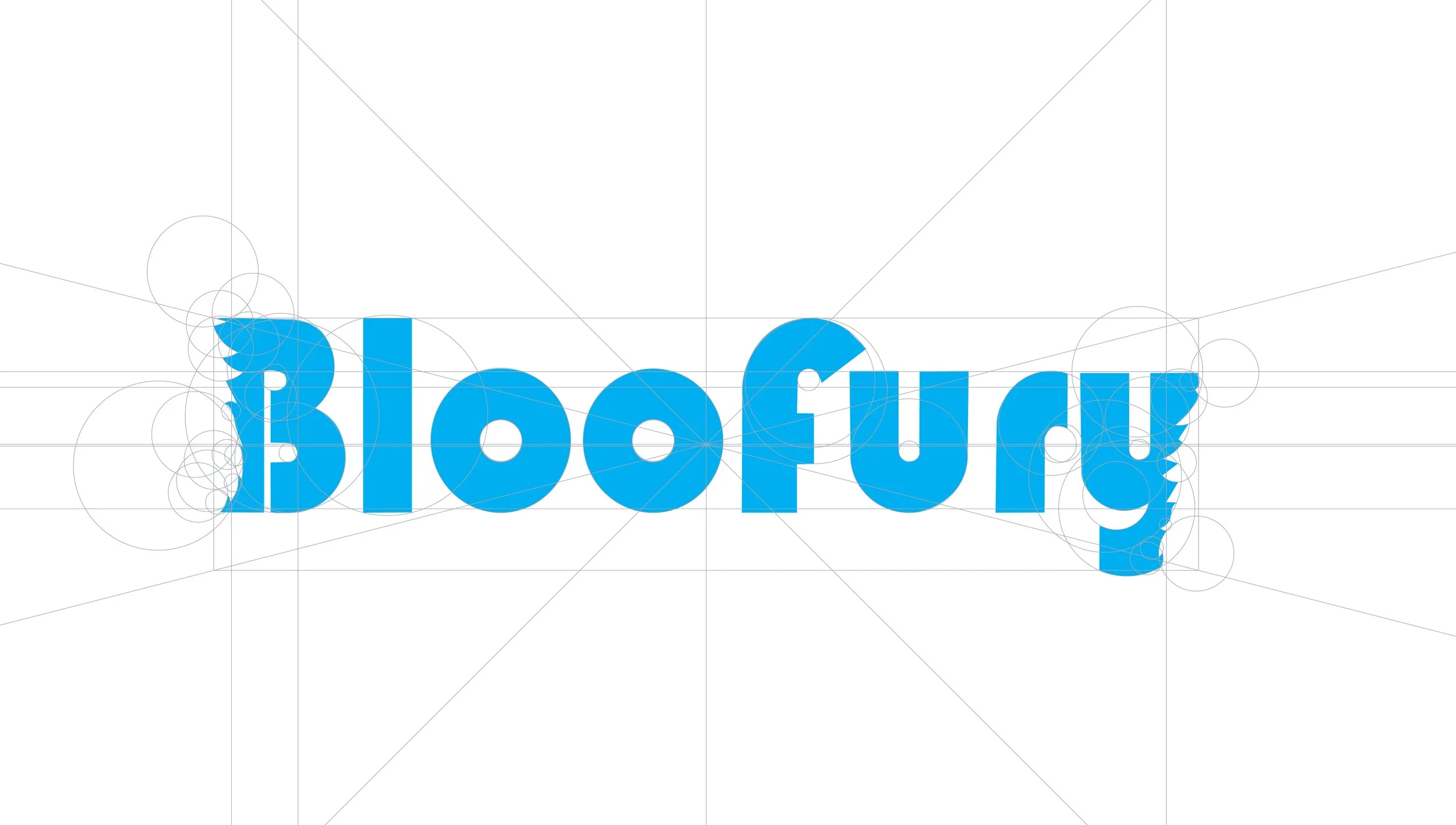
After developing Bloofury's main character, I explored ways to integrate its personality into the brand identity without relying on a direct character illustration. To achieve this, I incorporated a subtle silhouette of the character as negative space cutouts on both sides of the logo. This approach creates the impression of the character's presence while maintaining a clean, versatile logo mark. The result is a distinctive identity that reinforces the brand's personality in a refined and understated way.


Color Palette
Bloofury’s color palette was designed to balance innovation with playfulness. Vibrant blues were chosen as the primary brand colors to communicate technology, creativity, and digital innovation, while bright yellow accents inject energy, optimism, and a sense of fun. A deep navy tone provides contrast and stability, grounding the identity and enhancing readability across digital applications. Together, these colors create a dynamic visual system that feels modern, approachable, and engaging, reflecting Bloofury's personality as a forward-thinking brand with a playful spirit.
Typography
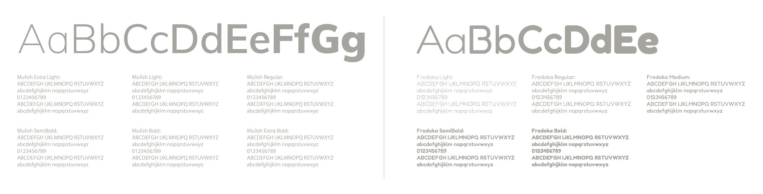
The Bloofury typography system combines Mulish as the primary typeface and Fredoka as the accent typeface to create a balance between professionalism and personality.
Mulish serves as the foundation of the brand's communication. Its clean, modern, and highly legible design supports the brand's tech-focused identity while ensuring clarity across digital and print applications.
Fredoka complements Mulish by introducing a playful and approachable character. Its rounded forms reflect the fun and energetic nature of the brand, making it ideal for highlights, headlines, and expressive brand moments.
Together, these typefaces create a versatile visual language that feels innovative, friendly, and engaging, perfectly aligning with Bloofury's vibrant and technology driven personality.
Iconography & Pattern
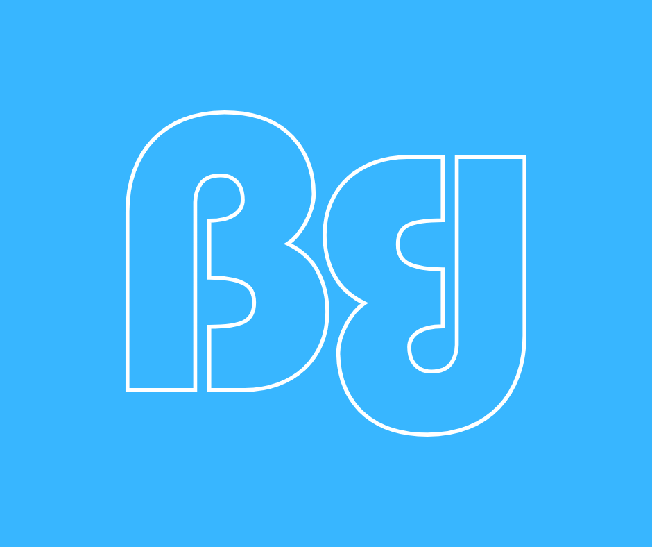
The iconography system was developed from the letter "B", the first letter of Bloofury. Using the same rounded geometry and bold forms found throughout the brand identity, the icon creates an instantly recognizable visual asset that can stand on its own. A repeating pattern was then generated from the icon, providing a flexible graphic element that enhances brand recognition and creates consistency across digital and print applications.



UI/UX Design
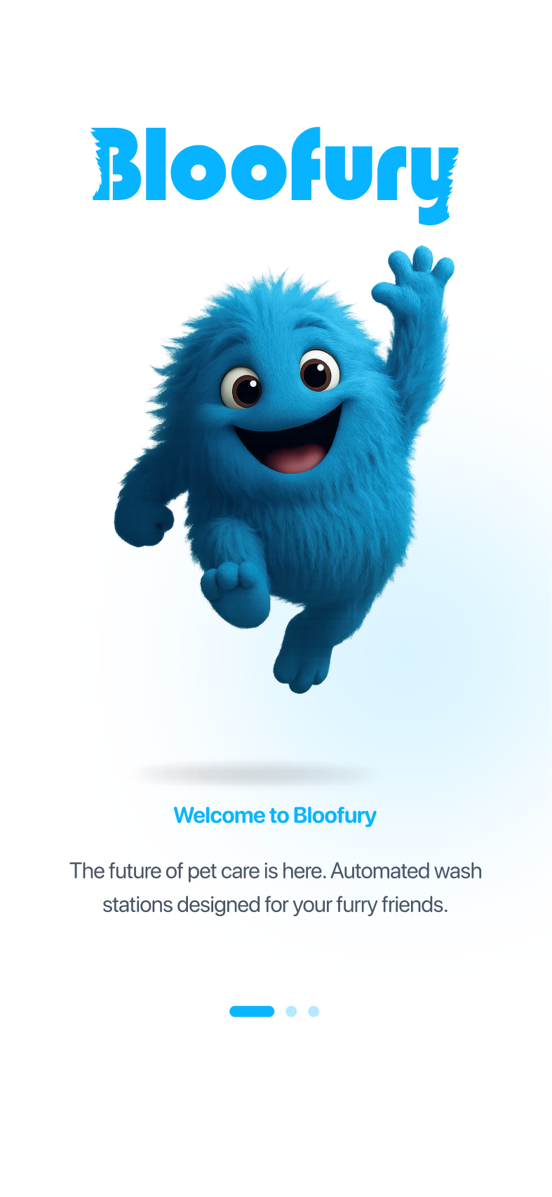
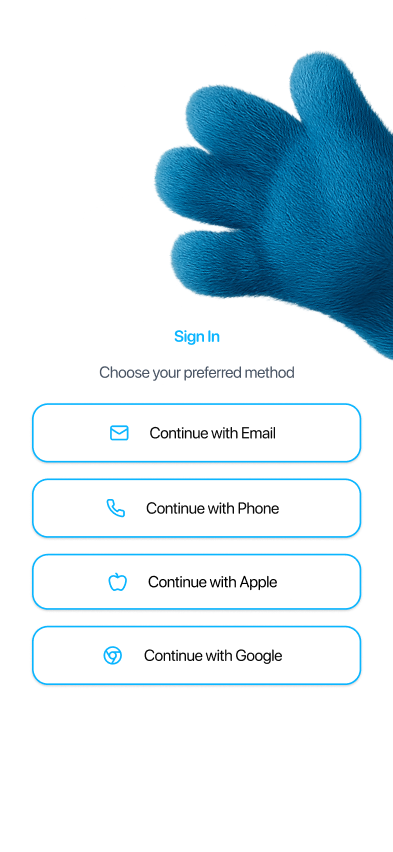
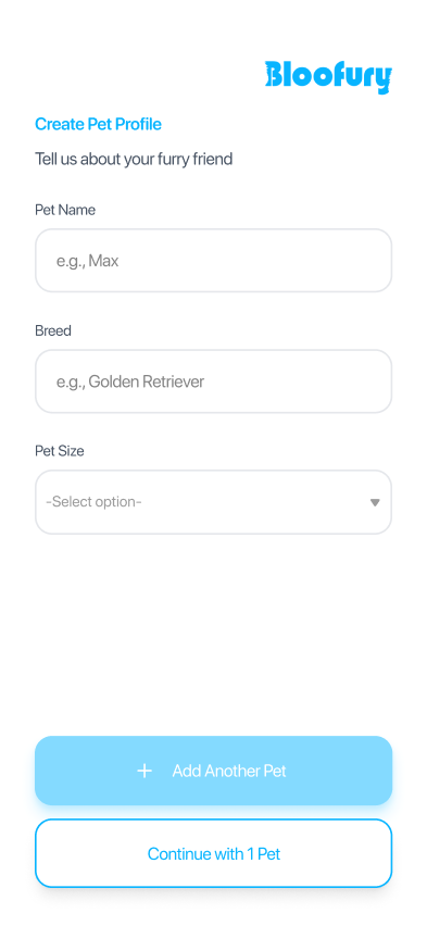
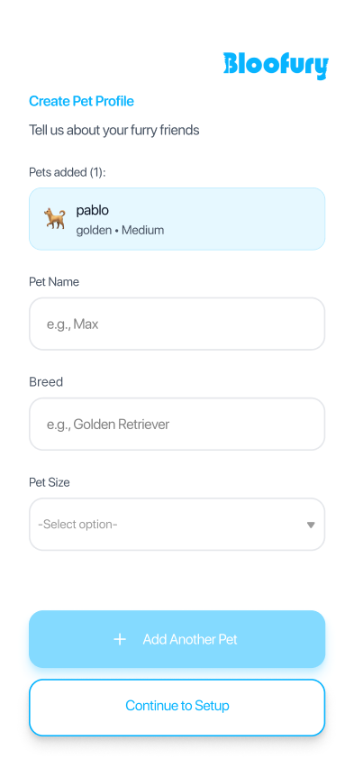
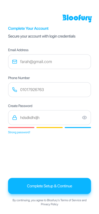
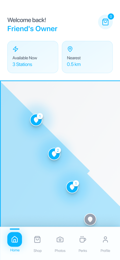
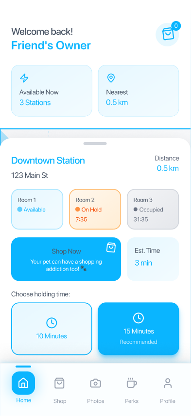
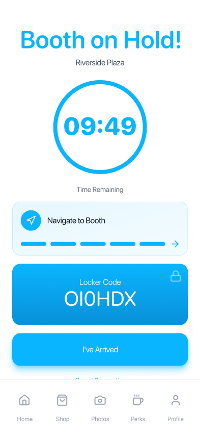
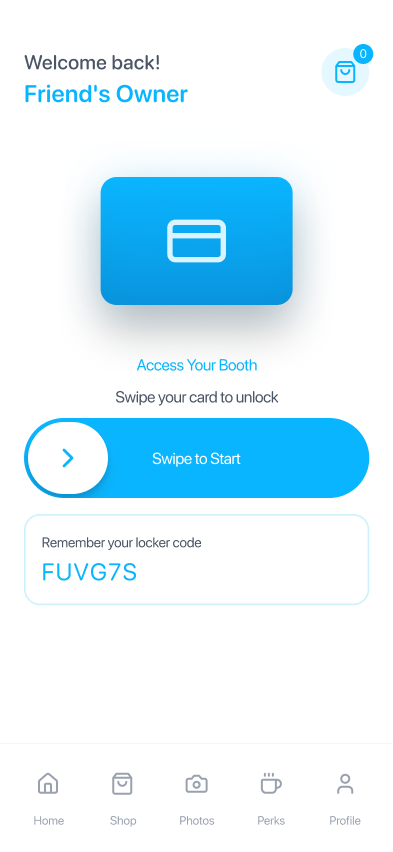
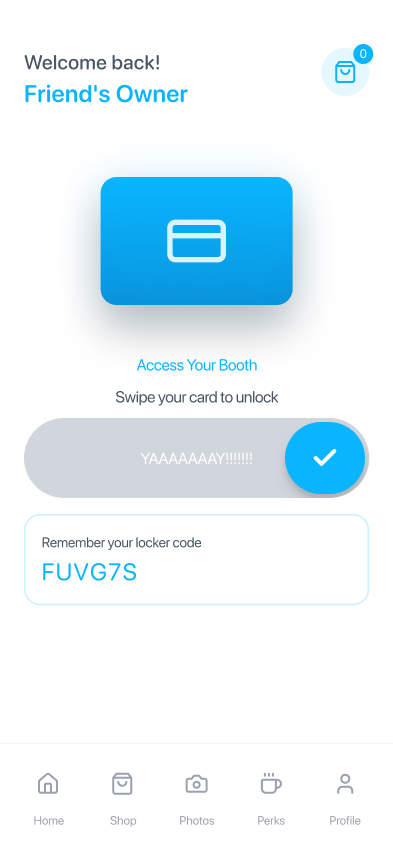
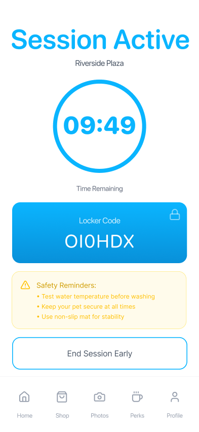
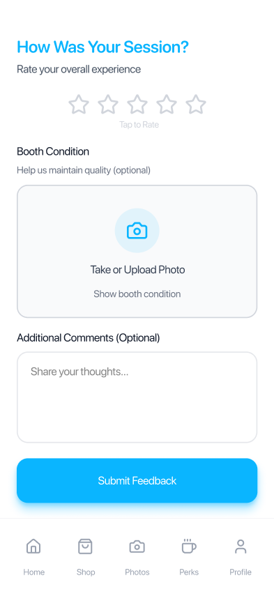
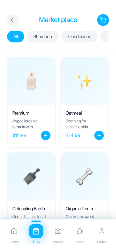
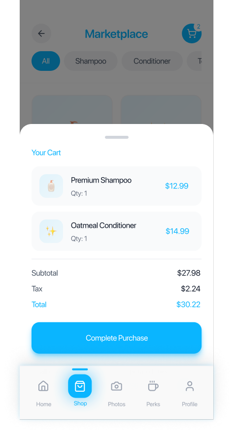
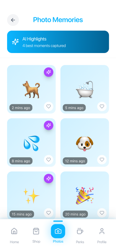
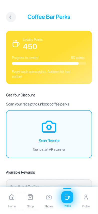
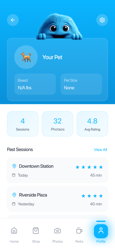
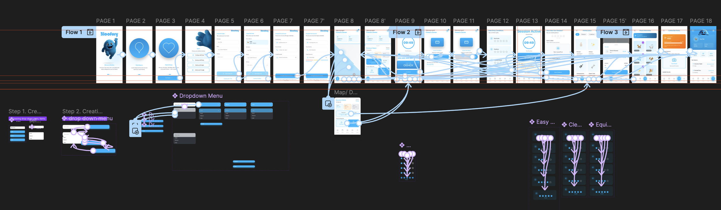
I designed the Bloofury user experience to feel playful, engaging, and highly interactive while maintaining a polished and contemporary aesthetic. By incorporating character-driven interactions, thoughtful micro-animations, and intuitive user flows, I created an interface that encourages exploration and increases engagement without compromising usability. Special attention was given to balancing personality with sophistication, ensuring the experience remained fun and memorable while avoiding the overly childish or gimmicky feel often associated with character-led brands.




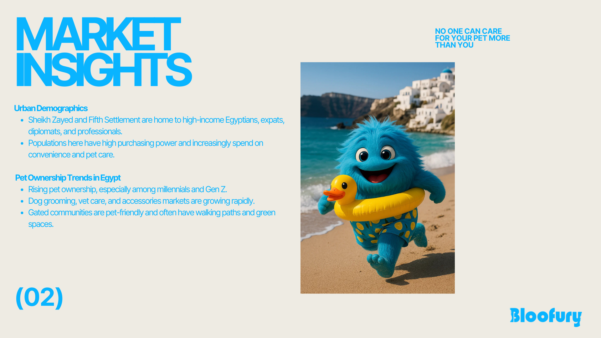
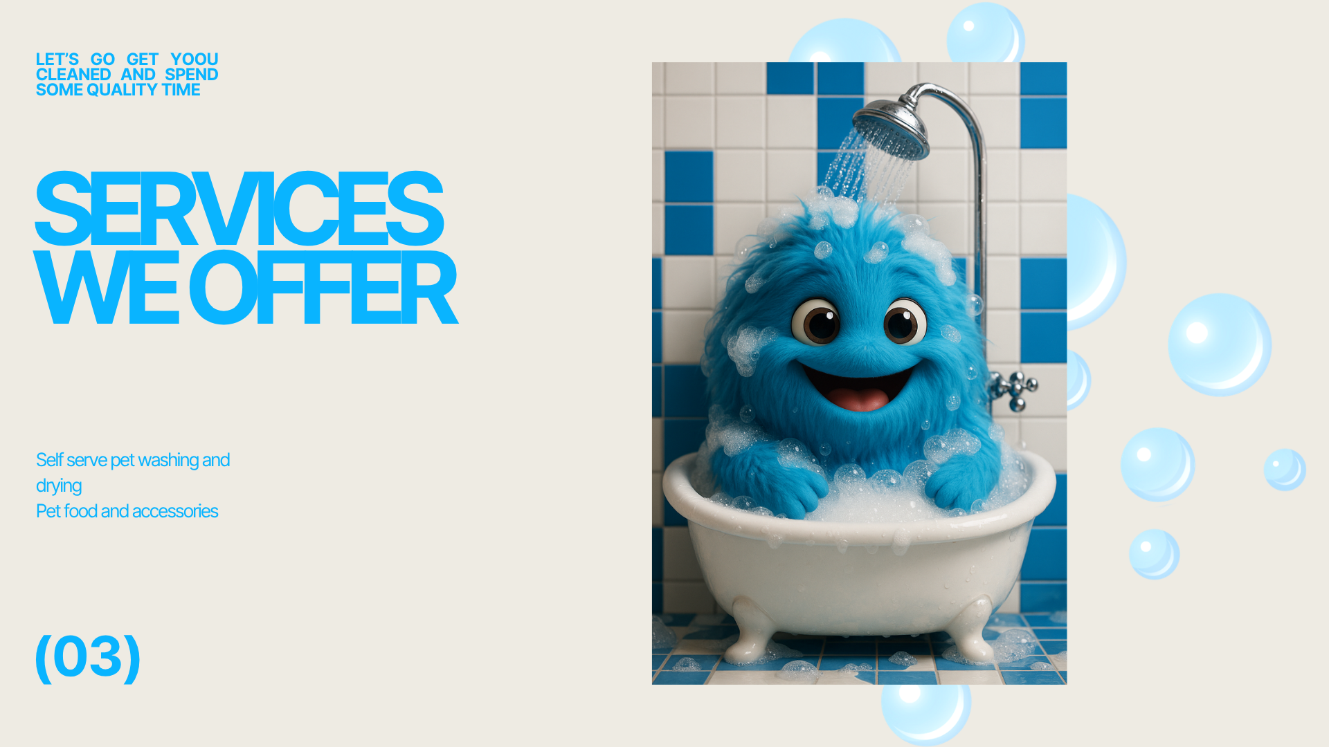
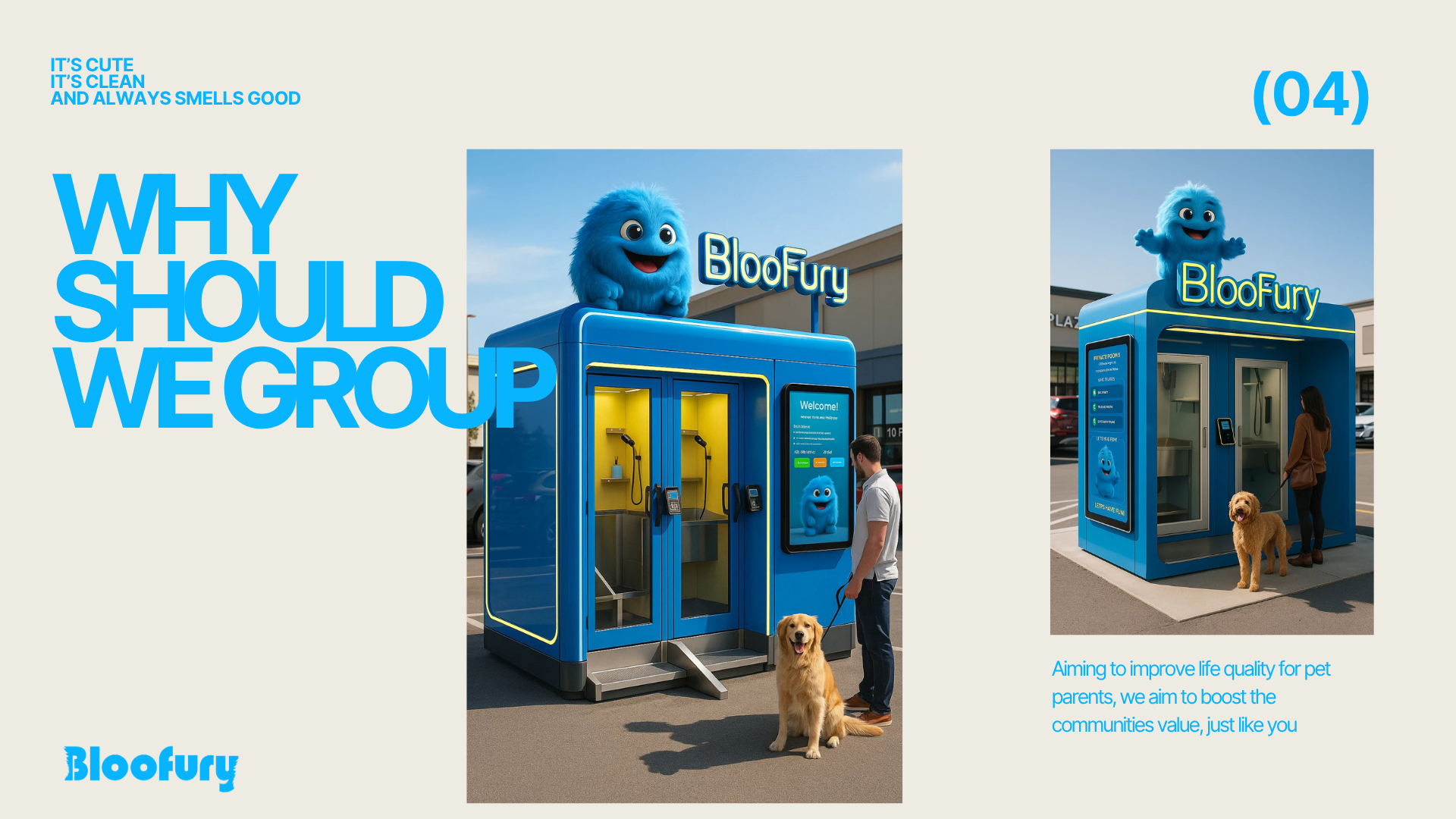
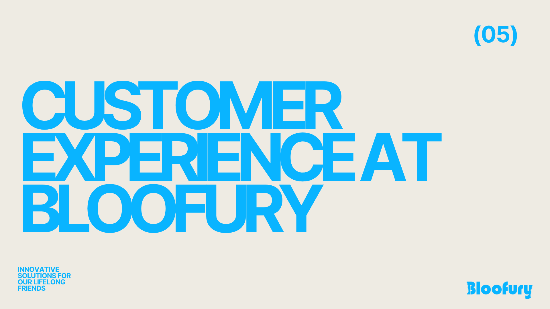
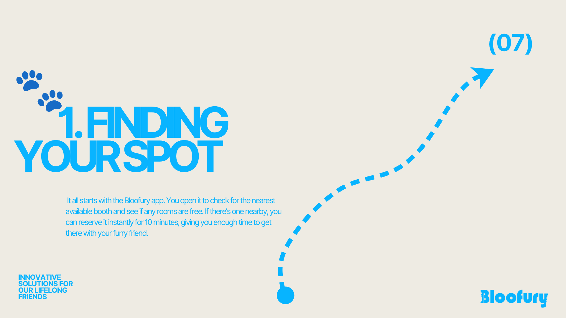
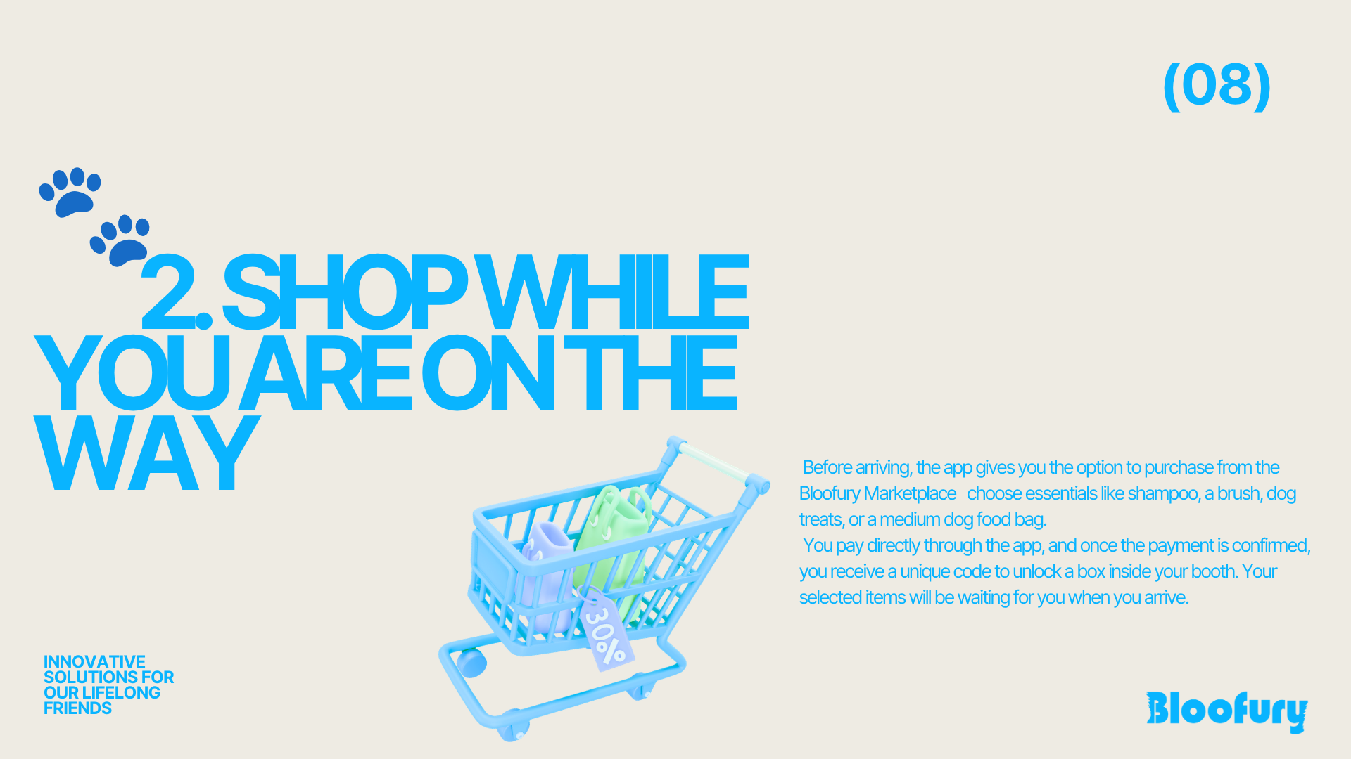
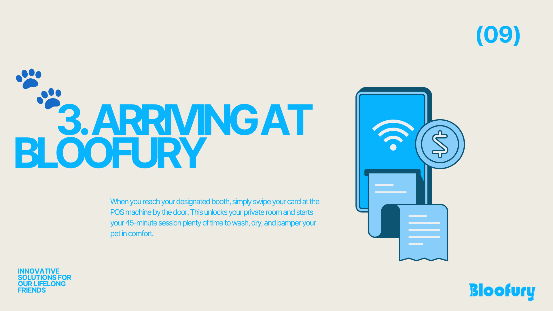
Pitch Deck Presentation Design
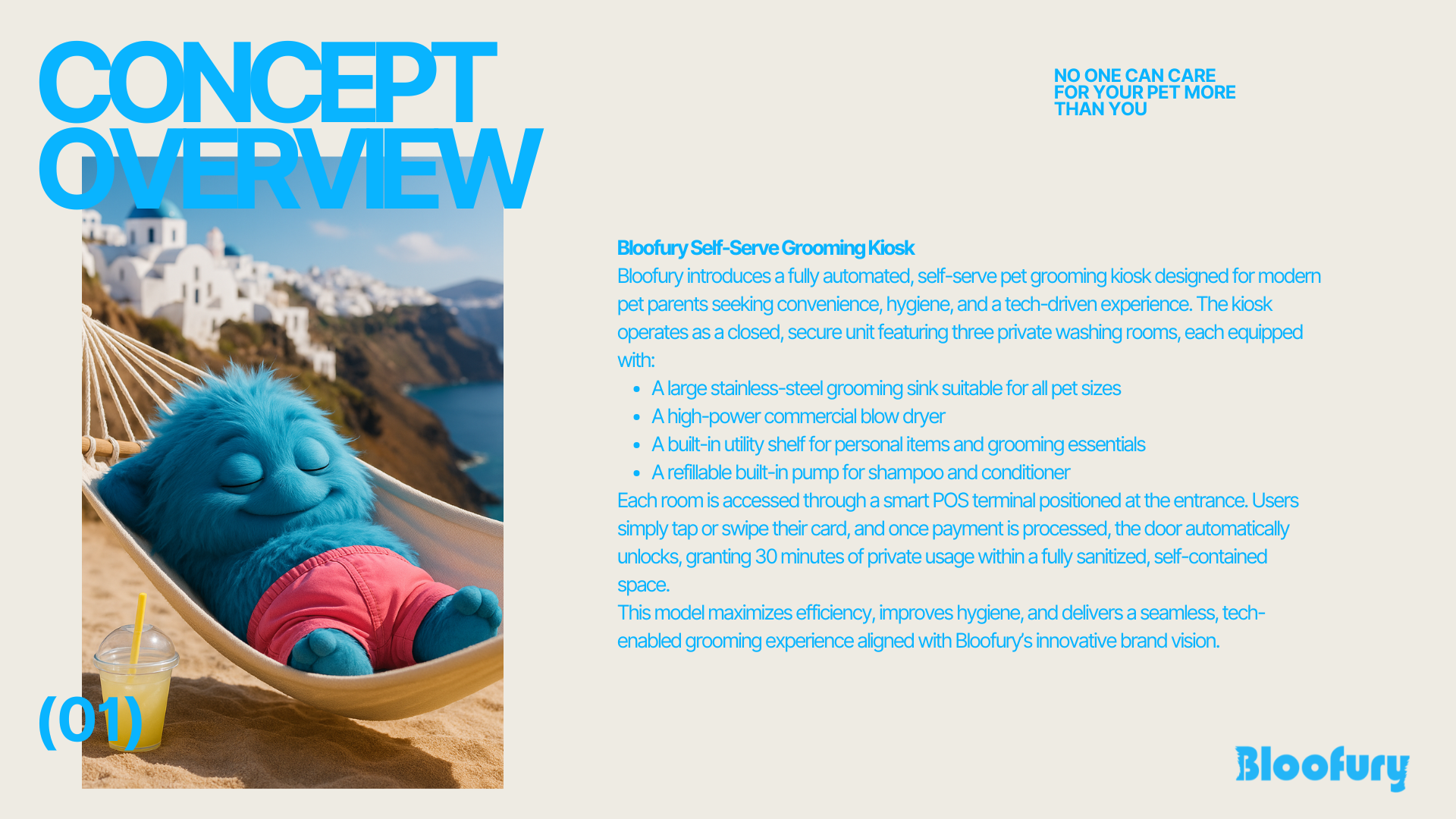
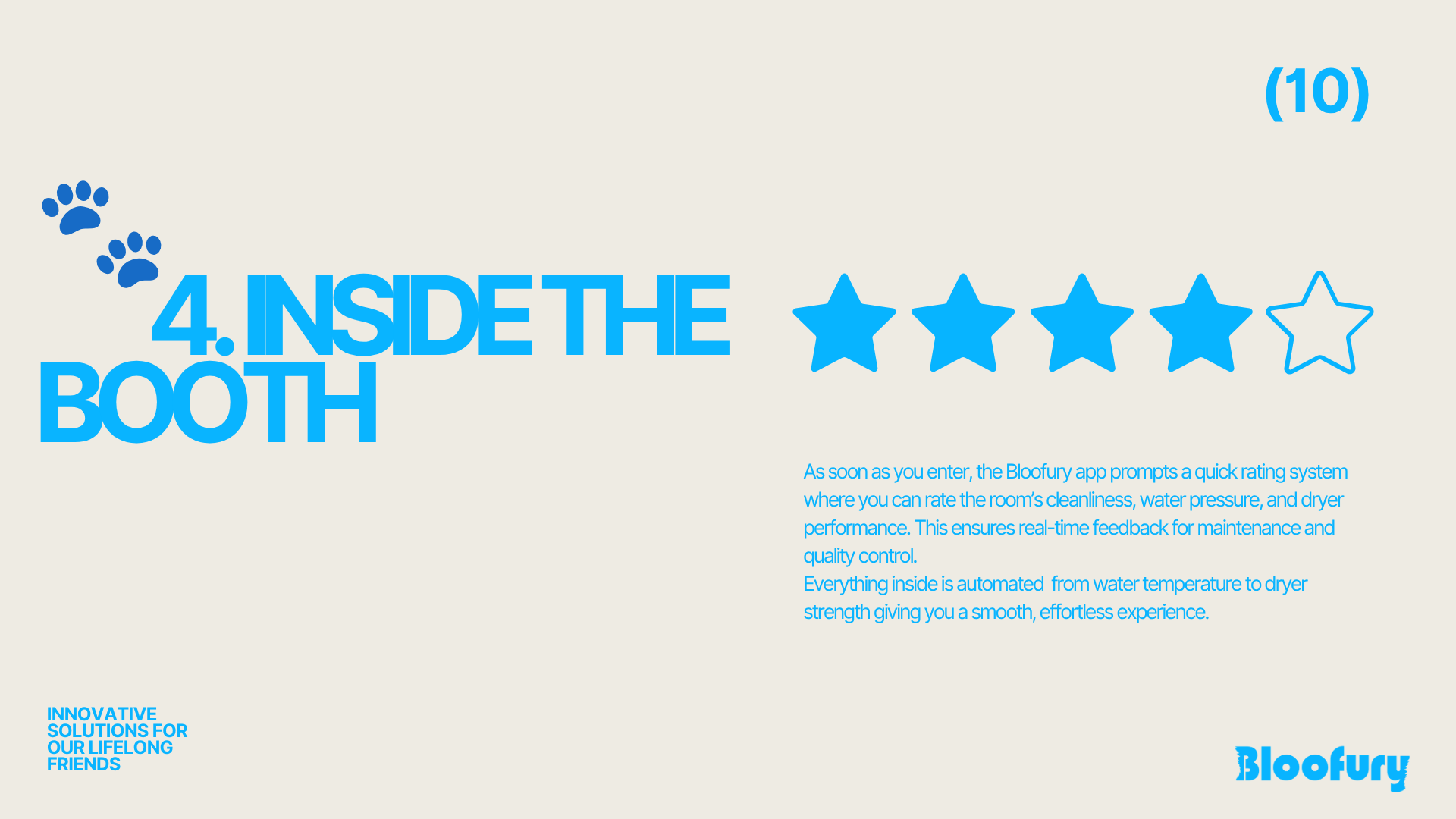
The Bloofury pitch deck was designed to bring the brand story to life through a dynamic and visually engaging presentation.